top of page

Send Chinatown Love
UXUI / WEB / BRANDING
APRIL 2020 - NOW
Send Chinatown Love is a brainchild that stemmed from a community of young NYC professionals who felt powerless as COVID-19 ransacked the small businesses we loved and relied on back in March 2020. With the decrease in foot traffic caused by pandemic and anti-Asian sentiment, many Chinatown merchants are struggling to stay afloat and were often overlooked for small business loans provided by the city due to lack of translations and confusing paperwork. Our goal was and still is to provide direct and immediate relief to these small businesses and help them stay afloat until normal business can resume.
My role is the Product Design Lead in a Product team of 3 designers working closely with with the Engineering team.
IMPACT
$1,210,178
raised via donations for AAPI small businesses
66,650
meals donated to people in need via the Gift-a-Meal initiative
63
merchants supported directly from fundraising efforts
GOALS:
-
Reach cash-only, pen-and-paper businesses that can’t use most gift card, donations, or app solutions and provide direct relief in cash to merchants that need it
-
Facilitate community monetary support by creating an online presence for the merchants, speaking their language, paying in cash, and doing all the heavy lifting
-
Discover ways to support the NYC AAPI (Asian American Pacific Islander) community, pivoting as needed
This non-profit has been operating since the very start of the Pandemic and has evolved quite a bit in mission and initiatives.
This case study will cover a few main features within the overall website: the landing page and the fundraising user flows. Please reach out if you're interested in learning about any other areas not covered.
I’ll be covering the work we did in two sections: 2020 - 2022 and 2022 AND ONWARDS.
2020 - 2022
RESEARCH
Chinatown in New York City is not just Manhattan’s Chinatown – there are unofficially nine Chinatowns where Chinese people have developed communities and created small business hubs. We spoke with Chinatown merchants across Manhattan, Queens, and Brooklyn right at the beginning of COVID-19 shutdowns to understand where they were struggling.
We had Chinese-speaking team members that reached out to their community via friends-of-friends, neighborhood aunties and owners of local restaurants. The purpose was to understand merchant needs to assess how we would be able to support them best.
A few themes emerged very quickly:
-
Larger businesses that had online presences and/or delivery were quick to pivot to selling delivery, meal kits, and gift cards
-
Smaller cash-only businesses often had no online presence or delivery – ultimately without a safety guard during the pandemic
-
These Asian language-speaking businesses often did not have the resources to apply for small business grants or support from the US government
BRAND
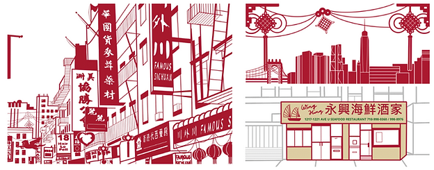
In the depth of the pandemic with a fully virtual team of volunteers, we had to work with businesses that had zero online presences. Sometimes we couldn’t even find have photos of their storefront. We developed a brand that was personable, self-made, and relatable to the team and our community.
We focused on what could be done from the confines of our isolation - illustrations of our NYC neighborhoods and storefronts (sometimes with only Google street view as reference). Our deep red brand color resonates throughout all the assets we create for our product and social platforms, accessing a strong brand identity that was recognizable online against other similar organizations.
Samples: Illustration style

Samples: Social media design language
USER TESTING AND FEEDBACK
Throughout this case study, I cover multiple variations of our product as our product and offerings matured over the last three years.
I've felt very fortunate to work on a project where our product was so quickly shipped to production, but that does not go without flaws. What we know most about our users comes from our Instagram community. User testing included exploring features and ideas with our internal organization (100+ of people who fit within the main user group demographic - more on that below) and conducting polls via social channels.
We conducted prototype playbacks and feedback sessions as an organization before finalizing and building any functionality. Thankfully the main user flows were similar to standard donation or checkout flows. We leaned heavily on those best practices as we built out the main functionality. For campaign-specific product builds, we had the liberty and blessing of the engineering team explore fun and interactive builds.
Over time, we learned that what we were proud of--being self-made and self-built--was reducing the efficiency of the overall product. In 2022 AND ONWARDS I will cover how we took a step back from our custom built product.
DESIGN - SENDCHINATOWNLOVE.COM LANDING PAGE
At the beginning of the project, we were targeting three main user groups: the Individual Donor, the Corporate Donor and the Small Business Owners.
User Group 1
The Individual Donor
These were our main users:
-
Tech savvy
-
Heavily utilizes social media
-
Tuned into recent news, especially within the NYC area
-
Greater New York Area ranging from 16 - 35 years of age
-
Enjoys exploring restaurants and new businesses in their local area
-
Wants to be engaged in community events and efforts
We curated the landing, merchant, fundraising, and campaign pages to explain our mission to these users - driving engagement and curating a feeling of community support for a grass-roots initiative.
Most of our focus went into providing this user group with the best donor experience.
User Group 2
The Corporate Donor
These are a subset of the main users:
-
Communicates directly with PR team via corporate partnerships or word-of-mouth
-
Rarely utilizes social media for information
-
Donates in large sums to 501(c)(3) organizations
For a new non-profit, it was important to curate information for these users to provide an air of legitimacy. These users may check our webpage for research as the first step but will speak directly with our PR/Ops teams for more detail. There are far few of these types of users but of course their impact is far greater than that of the Individual Donor.
Given the nature, most of the communication geared towards these Corporate Donors occurs offline directly with our team.
User Group 3
The Small Business Owner
These are prospective merchants utilizing our page to learn about our initiatives and raise their hands to join:
-
Asian (primarily Chinese) language-speaking
-
Not tech-savvy
-
Very tuned into their community
-
May be hesitant / embarrassed to ask for help
We created a language toggle that switched each page to a Chinese-translated page. We also developed a Resources catalog that provided tools for reopening logistics, safety protocols, and legal guidance.
Over time we learned that most of our target merchants were much less digitally-savvy than we expected and responded better to in-person requests and printed handouts.
We slowly deprioritized this set of users on the digital tool as our Merchant Experience team revved up in-person outreach.
Our first year was focused around learning more and building trust with the above three user groups.

> NAVIGATION
Our Navigation is ever changing to support our changing mission over the last 2 years. We prioritize our fundraising pages and will promote time-bound campaigns within our Navigation bar. As we grew and explored different initiatives, we also created pages to house our work, explain permanent initiatives, and archive our past campaigns. The ability to highlight this work also provides legitimacy to larger corporate donors and news outlets.
> LANDING PAGE
The Landing Page has undergone many iterations since the beginning. Below I've highlighted some of the important changes that we made from the first to the current iteration.
-
Navigation: As mentioned in the user group breakdown, some of our features were created specifically for the Small Business Owner group (i.e. Resources and the language toggle). With analytics over the first year, we discovered that these features were rarely used and the maintenance effort outweighed the value.
-
Hero: The visual identity has adjusted over time from illustration-heavy to a balance of the two. We were limited in the beginning by the stay-at-home order and could not capture the photography of the community that we were hoping for. Over time we transitioned our visual identity to highlight our "boots on the ground" work.
-
Our Background: The first year, the biggest focus of our efforts was to build in 3 directions: relationships with our donor community, relationships with potential small merchants, and relationships in the community via partners and corporate sponsors. It's clear we were trying hard to build legitimacy and trust in the first version of our site - but as we matured, we honed in on the few steps of our Approach and simplified the text blocks for the reader.
Landing Page: Comparison between 2020 and 2021. Click to zoom hover.

DESIGN – FUNDRAISING
The most important feature of the product suite was the Merchant Donation flow – aimed to tell the Merchant story and create an opportunity for the community to connect with these Asian-owned businesses.
Our social media channels were the main point of contact with our donors. We conducted multiple variations of surveys and leveraged Instagram analytics to understand who was engaging the most with our content.
Our Main Audience were people in the Greater New York Area ranging from 16 - 35 years of age.
By understanding our key audience, we created a custom build digital platform that was both web and mobile responsive.
The main sections to highlight were focused on how to make the merchant personable:
-
The merchant’s story, highlighting the impact of Covid-19 on their business
-
A custom drawn image of their storefront in alignment with SCL branding
-
A donation progress bar to incentivize donors to help reach the next milestone
-
Images of the merchant, products, food etc
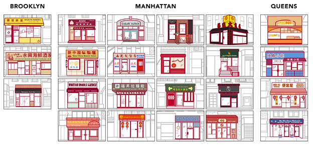
> MERCHANT DIRECTORY - MEET OUR MERCHANTS
When we first started, we only had a few merchants and were unsure how many businesses we would eventually acquire.
The main focus was to provide each merchant its time to shine – every merchant was guaranteed its own donation page and would be highlighted on a merchant directory. Hand-drawn storefronts, story blurbs, and a milestone progress bar was present for each merchant – with the goal that those who landed on the page would donate based on progress status to one or more businesses.
The user flow was simple:

However, as we added 5, 10, 20+ merchants, it became clear our community could not always connect directly to a merchant – thus experiencing decision fatigue for which business to donate.
We eventually added the option to donate to the “Send Chinatown Love Fund”, a general bucket of funds that we split evenly across all our merchants. We added an aggregated progress bar to the directory page that highlighted the split of donations across our main support lines.

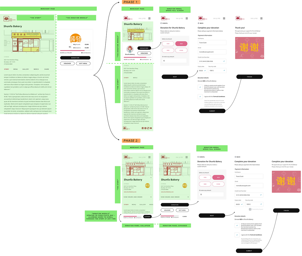
Donation user flows: Phase 1 and Phase 2 (web)

Merchant Directory (Meet our Merchants): Phase 1 and Phase 2 (mobile & web)

2020-2022
> MERCHANT DONATION PAGE - 2 PHASES
In our first phase, the Merchant Donation page was split into two main panel sections: The Story and the Donation module. The mobile experience was just a restacking of the web experience – the donation panel was brought to the top of the page and users would need to scroll below the fold to learn that there was a story even involved. The order of operations did not make sense.
With more time, we decided to re-do our most important page to be more responsive and user friendly on mobile. In our second phase, we moved the story blurbs back to front-and-center and shifted the donation interaction to a fixed bottom navigation with just the donation progress bar and a “Support” call-to-action.
Users can interact with the full page while always having the CTA available for quick access. The fixed navigation expands to a third of the page to show support options: “Donate”, “Voucher" and “Gift Meal” – from there the user is at the inflection point of whether they’re ready to proceed to the next step or close the navigation to return to the story. The donation modal remained the same for continunity.
Merchant page and Donation flow: Phase 1 and Phase 2 (mobile)
2022 AND ONWARDS
SHIFT FROM FUNDRAISING-FOCUSED TO SERVICE-FOCUSED
As the impact of the pandemic has lightened, the mission to provide direct donations to individual merchants has also reduced in importance. Our team mission has course corrected to garnering donations for our other support streams—Gift-a-Meal and Business Development. Additionally after many learnings and much technical debt, our team has pivoted to moving from custom build to migrating all our products to a site-builder.
Thanks to the above two points, the product team made a large pivot in 2022, we:
-
Removed the Merchant Directory and individual Merchant Pages
-
Streamlined the donation flow by simplifying to one singular donation touchpoint
-
Developed a responsive interactive map to allow site-viewers to continue exploring our merchants across the boroughs
We continue to highlight the merchant’s story, their hand-drawn storefront, and any past campaigns we’ve conducted with them. The donation experience was simplified into an embed of the Square payment to allow for the most accurate payment experience that would automatically update with Square’s updates.
New Donate Page: Phase 3 (web)

CHALLENGES AND LEARNINGS
Tracking KPIs and validating UX updates
Many of the spikes in our donations were directly correlated to our social media campaigns – if there were unique campaigns we were promoting (i.e. a merchant experienced a fire or break-in and needed immediate funds), there would be an obvious spike in donations that were unrelated to our donation experience. Therefore it was tricky to track and analyze how changes in UX were directly correlated to increase in user conversion.
Technical debt from custom build
Our Engineering and Product teams were especially excited during the first two years for freedom in our custom builds and to work incredibly quickly. Because we did not foresee whether this would be a long-term product, the solutions built served limited use cases that couldn’t easily be utilized when we wanted to grow our product. As our product matured, we could no longer work with agility because of the rework required. As we began to shift away from a fundraising-focus, we took the opportunity to step away from our custom builds and shift the donation process to a streamlined Square operated module that we embedded into our site builder.
Custom build to site builder
As we shifted to a site builder (Weebly), we needed to let go of the mobile-first design approach. Weebly’s site builder requires the layout be built directly in the web experience first—with limited option to adjust the mobile experience. By starting web-first, this really required me to keep things simple, knowing that complex experience rarely translated well to the responsive theme.
Managing a volunteer organization
Tangentially to the product work, I learned tremendously about the power of individuals coming together as volunteers to support a mission. Folks took on roles they previously never had experience in and became the subject matter experts. Unfortunately, in the same vein, an organization cannot be managed entirely with passion. Passion dwindles, the pandemic shifts to the background, and “real life” returns. Dropping participation in weekly to monthly meetings, old cohorts burning out from 2 years of non-stop work, and a decreasing urgency to support our mission in Chinatown resulted in a massive deceleration. I believe this team was exactly where it needed to be when it started, and where it is now is where it also needs to be.
OTHER PROJECTS
Send Chinatown Love is constantly looking for ways to further help the Chinatowns across New York and their surrounding communities.
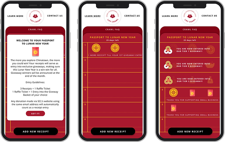
Community initiatives like the Send Chinatown Love Food Crawl in Sept 2020 and 2021, Light Up Chinatown in Dec 2020, Lunar New Year and APAHM Gift-a-Meal campaigns were launched with the goal of bringing much needed foot traffic and business back to Chinatown.
We had fun flexing our creative muscles to create unique experiences for the food crawls. We built a “Passport to Chinatown” for the food crawls: which included a map of Manhattan’s Chinatown, a digital “punch-card” for collectable codes at the participating restaurants, that resulted in raffle points you can apply to a range of donated gifts from participating brands. This was a big lesson in gamification, aligning real-life experience with a digital platform, and the slew of marketing, PR, and social coordination.
Our Business Development Team works directly with Merchants to create digital presences and assets (menus, logos, branding) that can be reused for online and in-person contexts.
Our teams also have leaned into community crowd sourcing for stories and recipes, creating publications of a Send Chinatown Love Letters: Zine and a Send Chinatown Love Digital Cookbook.
Lunar New Year Food Crawl "Passport to Chinatown" - 2021
TEAM
Ling Song (Product Lead), Jason Barnett (Engineering Lead), Jessica Chien (Illustration, Design), Karen Lee and Chel Chan (Product Design)
2022 and Onwards
bottom of page