top of page

Transfer Agency Investor Portal
UX / WEB / MOBILE
Our large Financial Services client reached out to IBM to conduct a massive digital transformation that would take them to the forefront as a transfer agency industry leader.
A transfer agent is a bank or similar institution assigned by a corporation, for the purposes of maintaining an investor's financial records and tracking his or her account balance. The transfer agent records transactions, cancels and issues certificates, processes investor mailings and handles a host of other investor problems, including reissuing lost or stolen certificates.
Currently, the industry standard for transfer agency processes is (still!) reliant on phone calls, emails, and even faxes for all levels of business including investor onboarding, trade processing, fund maintenance, and customer support. IBM was brought in to was to entirely digitize the end-to-end transfer agency process.
My role was a UX Designer in a Product team of 3.

OUR GOALS:
BUSINESS
USER EXPERIENCE
Take the Investor end-to-end experience online: Allowing the investor to onboard themselves digitally, make and cancel trades and transfers on their own, view portfolio and holdings.
Understand the breadth of investor types, user needs and tasks that our solution must solve for.
Research current day financial institutional digital solutions and customer expectation
Take the Fund Manager experience online: Allow Fund Managers to view and approve of onboarded investors and trades, view fund performance, track dividends, and interact with transfer agent at any time
Understand current day processes and touch points between Fund Managers and Investors / Transfer Agents, in order to discover pain points and inefficiencies
Take the Transfer Agent experience online: Allow our client to service both the investors and fund managers from one seamless point.
Understand TA partners' "business-as-usual" model to discover how they would do the same tasks digitally or become self-service for the investor
Translate functionality and design into hybrid mobile and tablet applications.
Create seamless templates to translate Web in relevant Tablet and Mobile use cases
RESEARCH / WORKSHOPS
The legacy systems were so reliant on paper and fax methods that we knew we had to get to the core of the persona needs to begin. We conducted multiple IBM Design Thinking workshops with stakeholders and potential users to draw out the key actions that each persona currently does in their day-to-day that would eventually be leveraging the portal.
Personas:
Retail Investor, Institutional Investor, Agent, Fund Manager, & Transfer Agency Partner

By creating Need Task Statements we could draw out what was most important to each persona to understand how to begin prioritizing needs into features.
The features were prioritized based on how crucial the tasks were to the daily work each persona needed to perform – as well as how many of these tasks may be duplicates across multiple personas.
One of the first obstacles we encountered was lack of access to users to interviews – due to the NDA of this project, our client could only provide access to Fund Managers.
PIVOTING OUR PERSONAS
As we began working through the financial personas (Retail Investor, Institutional Investor, Agent, Fund Manager, and Transfer Agency Partner), we came to a big turning point – we realized that we had not accounted for potential different users within each persona that would have their unique needs and tasks to be performed. It required a bit of a mental shift to understand how one persona could carry user roles, while multiple roles could also be held by one persona.
Turns out the original personas were in fact far too broad and we needed to account for the users that makes up the Institutional Investor, Agent, and Fund Manager.
We conducted a secondary workshop to understand who the main users of the portal would be across these three organizations – a similar format to understand their Needs, the Actions they would need to perform, and how often they would be triggered to perform this action.
At the end, we were able to formalize the 14 users/personas we had to account for:

The top row lists our Personas, and the following rows capture all the User Roles that could sit under each persona.
PAGE HIERARCHY - TABS
We began constructing wireframes with a tab structure in mind, knowing that we wanted to have the flexibility of certain tabs being available based on user responsibility - mixed and matched to ensure the user will only view what the needs we discovered in our interviews and workshops.

Across all personas' responsibilities:
Determining tab structure was an iterative process
PERSONA SWIM LANES
To better wrap our heads around how the different personas and roles played with each other, with created swim lane diagrams (or service blueprints) to understand the relationships. The system becomes easier to communicate with stakeholders and team members. It also allowed us. The below diagram is a very high-level future state of the Transfer Agency portal ecosystem.

HIGH FIDELITY WIREFRAMES
Focusing on the most time-sensitive and process-driven information as a priority, those elements predominantly took the form of cards that would change to reflect different statuses and could be clicked on to view additional information in an expanded view or in a modal. We utilized card structures for ease of scaling and repetition (especially to mobile and tablet). The secondary historical information often was presented in easy to navigate/filter tables, that scaled depending on user and expected number of items to ensure legibility.
Card Structure Examples
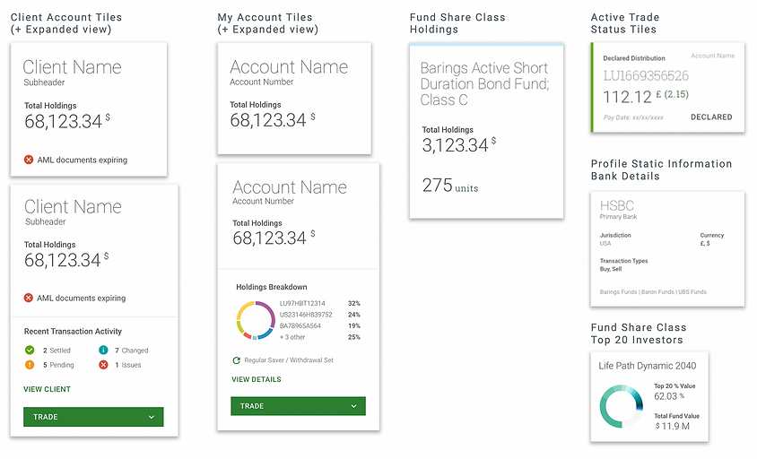
Along with that we focused on keeping the navigation as flat as possible – pushing tasks such as trading, editing information, viewing notifications or accessing the support center in a drawer that slides over the current screen. This helps make the important actions easy to reach. We were able to introduce access points to these features from many different pages without needing to create a complex site map.

Investor Portal Screens

Investor Portal - Institutional Persona: Account deep-dive to Trade journey
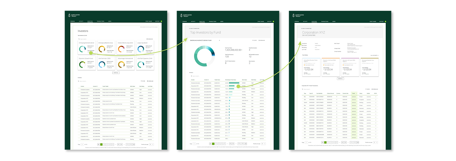
Investor Portal - Fund Manager Persona: Top Investors deep-dive to Investor Detail
ONBOARDING FLOWS
Due to the slow collection of business requirements for Onboarding, our team had to tackle these flows after the creation of dashboards. The current day process is extremely antiquated, still reliant on paper forms and faxing resulting in delays and lost information. Our goal was to get the user onto the portal as quickly as possible, so we took lengths to discuss with our business counterparts what questions and information was crucial to get from the user before they are allowed to enter the portal – versus what we could push off to a later time for input when they are in the moment of performing the task. While tricky to find a middle ground compromise that satisfies everyone’s requirements - we were able to simplify the flow tremendously.
For the Retail Investor onboarding, we also utilized face identity verification mechanisms to match the person’s selfie to their uploaded identification documents, resulting in real-time KYC approvals and less time to onboard.
A secondary but important flow of that we considered was the “Existing Investor” flow – for existing investors who already have accounts to onboard onto the portal with their existing information.
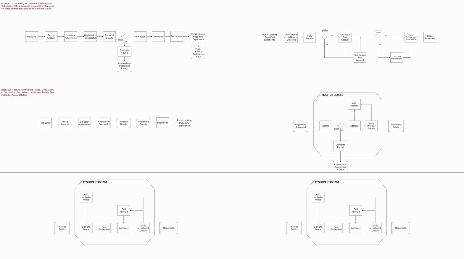
Retail Investor Onboarding Flows

Retail Investor Persona: Onboarding Screens
ENTERPRISE UX AND LESSONS LEARNED
Complex enterprise strategy had its challenges. We encountered many road blocks and business decisions beyond our power that created re-work, required Agile ways of working, and complicated user requirements.
Examples of Pain Points and Lessons Learned
Other teams' structural and backend limitations could drastically impact how we visualize information to the user.
Problem: The backend and data storage was unable to link Fund Holdings directly to a User's Trade "Account".
Solution: Our cost-effective compromise given the timeline was to create "Sub-accounts", allowing for mental money bucketing while tying Sub-accounts to Fund Manager IDs.
The UX team could not test on end-users (Institutional Investors) because of the highly NDA nature of the project.
Problem: Our client's NDA restricted us from searching beyond our project for user testing or interviews.
Solution: We hosted multiple working sessions with SMEs from the company who although were not the target user, could provide insight and feedback from the lens of the user.
Slow alignment of business requirements meant for continuous rework months after designs were finalized for development.
The larger the organization, the more critical it was to have clear and cohesive brand, UX, and data documentation.
Device usage of the same product depends heavily on the user's needs/tasks at a point in time or location, which will help frame which functionality should stay or go.
(Ideally) you always fight for the user but sometimes you have to bend to the technical constraints and business objectives.
We accomplished a massive lift within just six months, before moving to Mobile and Tablet - but the learnings I gained from being on this enterprise scale project with over 300 team members were incomparable.
I was able to understand how everything connects within our client's organization. I learned the reasons behind every goal and limitation that our team encountered, paired with the rippling effects each decision made carried downstream. We had very complex problems and were able to solve them with complex but elegant solutions. The goal wasn't just creating a usable platform, but ensuring that the experience both internally and externally were up to par with all other digital platforms consumers are familiar with in this modern age.
TEAM
Dominic Poon (UX Lead), Ewa Karweta (Design Lead), Jake Hurdt (Business Lead), Courtney Wu (Jr. Designer)
bottom of page